Background
Lē'ahi Landscaping is a local business in Hawaii, pioneering as the state's first all-electric, zero-emission landscaping company. They offer quiet, sustainable services using solar-powered equipment, embodying a commitment to environmental responsibility.
Responsibilities
User research, Wire-framing, Prototyping, Usability testing
Role
UX/UI Designer, UX Researcher
Design Tool
Figma, Adobe Premier
Timeline
80 Hours, 4 Weeks
Problem
The owners of Lē'ahi Landscaping dedicate significant time and effort to crafting manual job estimates in order to serve their growing customer base, while struggling with low engagement metrics on their non-responsive website.
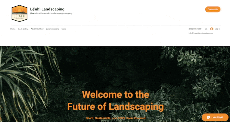
BEFORE
Objective
Explore and devise a solution to help streamline the manual job estimation process, while also identifying key areas of the website that keep users engaged in order to increase engagement metrics.
Competitor Analysis
In order to better understand the competitive landscape, I conducted an analysis of 4 direct competitors in the Honolulu landscaping industry. This analysis aimed to identify strengths and weaknesses in the competitors' user experience and functionality. The key insights from this analysis influenced our design decisions and feature set, allowing us to differentiate our solution. Below I outline the key opportunities that Le'ahi Landscaping could capitalize on.
✔️ Differentiate quote feature.
✔️ Make content more succinct, clear, and accessible.
✔️ Include a gallery of work.
✔️ Drive company's unique value proposition of sustainability.


User Interviews
4 participants, ages 35-60, 1 week
To better understand user needs and pain points, I conducted 1-on-1 interviews with 4 participants of the website. The goal of these sessions was to identify usability issues and gather feedback on new features under consideration. Participants were asked a combination of open-ended questions around their current usage as well as specific feature validation questions. Key insights gathered from the interviews included issues with copy length, unclear messaging, and need for features that showcases past work and pricing. Below I outline the key themes and insights gathered from the user interviews.
✔️ No gallery of past projects.
✔️ No pricing.
✔️ Unclear sustainability value proposition.
✔️ Too much scrolling due to lengthy copy.
INTERVIEW QUOTES
Ken (62), Gallery
"You could even show pictures of the work that they could do. Images should be relevant to work."
Germaine (61), Pricing
"Wish there was some kind of pricing available. Just to get a ballpark price range."
Kelly (35), Sustainability
"I like there sustainability aspect, however it was very confusing and I didn’t understand what “AGZA” or “Zero Emissions” was at first glance."
Krystle (44), Lengthy Content
"There’s too much scrolling going on, and there should be less clicks."
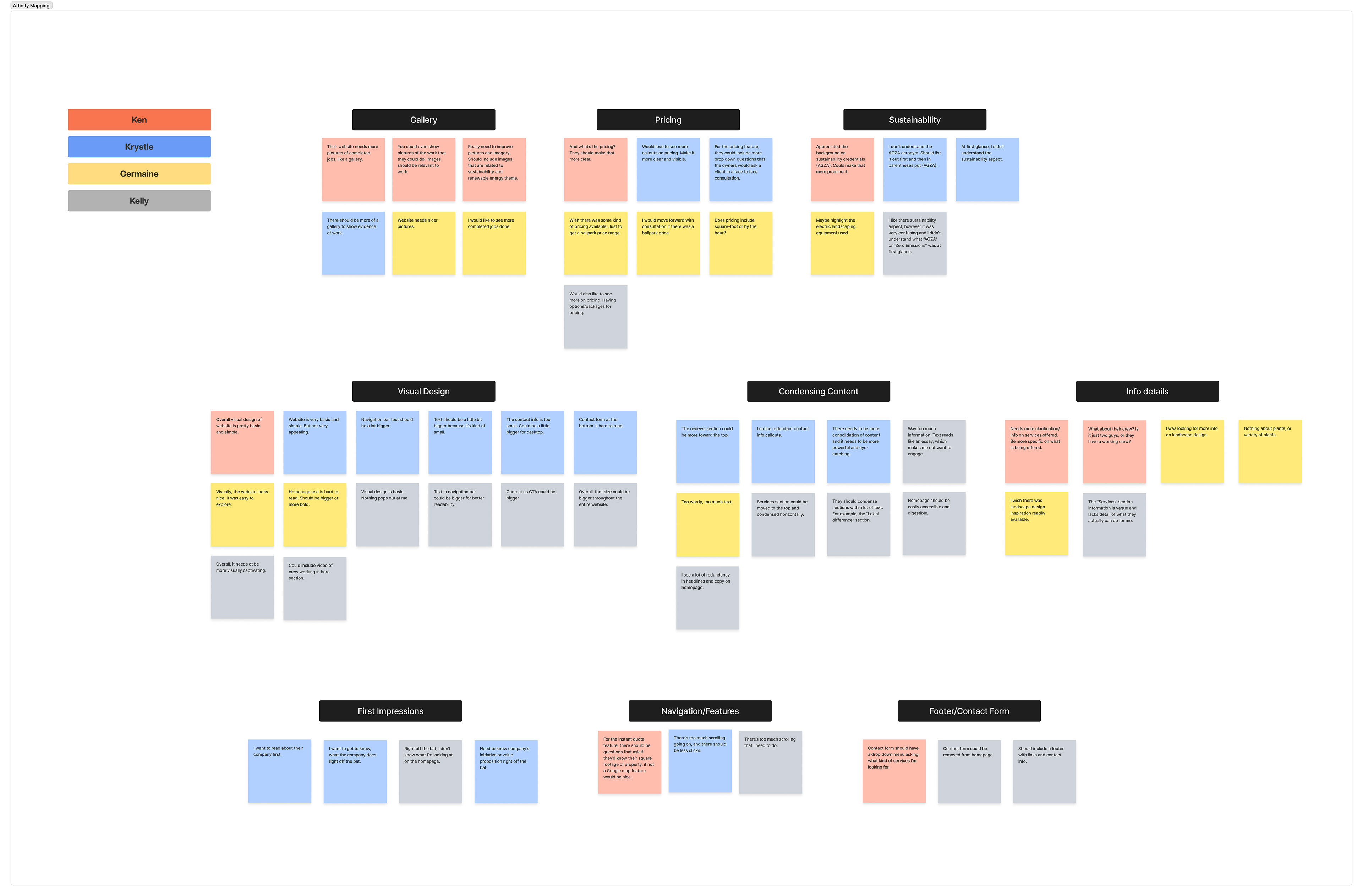
AFFINITY MAPPING
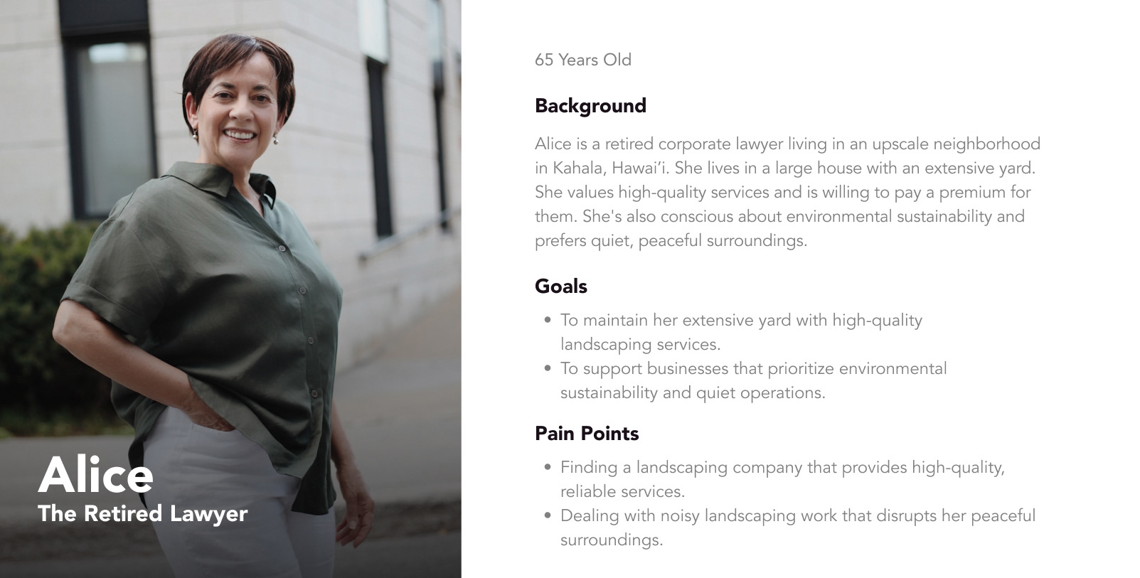
User Personas
I created two personas to gain a deeper understanding of my target audience, allowing me to re-design the Lē'ahi website more effectively to meet their needs.

DESIGN GOALS
🎯 Develop interactive job estimate tool for clients to receive quick quoters, streamlining the estimation process.
🎯 Create clear and visually-engaging messaging that highlights Leahi's sustainability practices.
🎯 Add a gallery section to showcase past client projects and services.
🎯 Remove unnecessary pages and condense redundant content to enhance information architecture and streamline site navigation.
Sitemap
My research revealed Lē'ahi's sustainability value proposition was unclear to interview participants, largely due to lack of clarity in related content and random positioning of sustainability topics on the site. The new sitemap nests all sustainability topics within a dedicated sustainability tab.
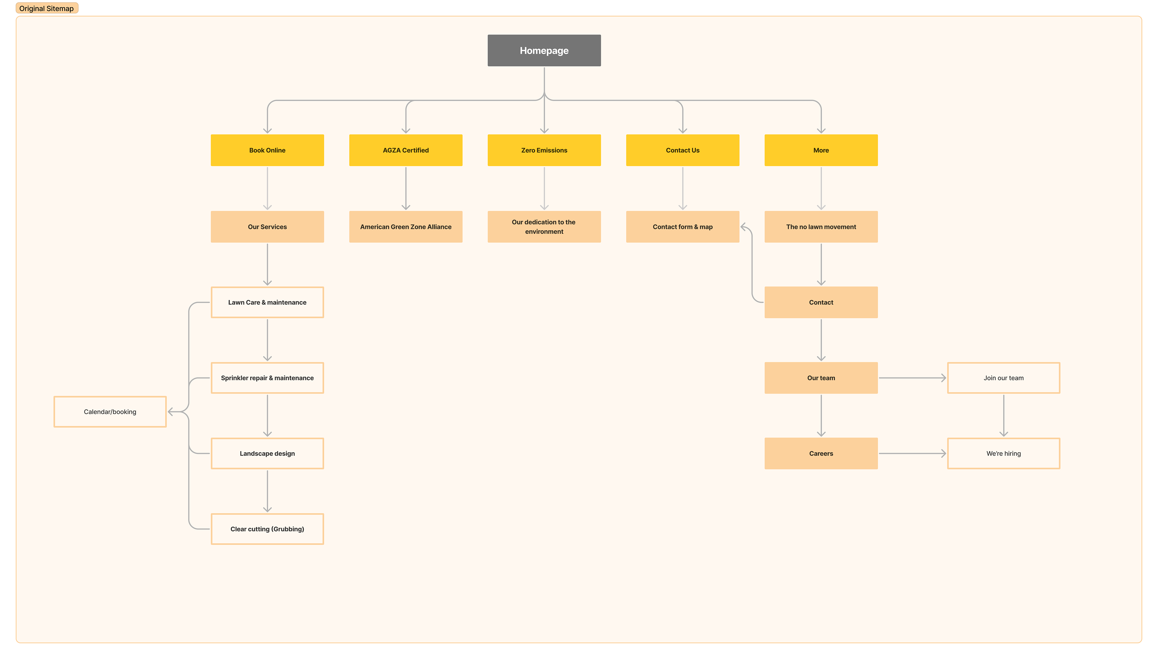
OLD SITEMAP
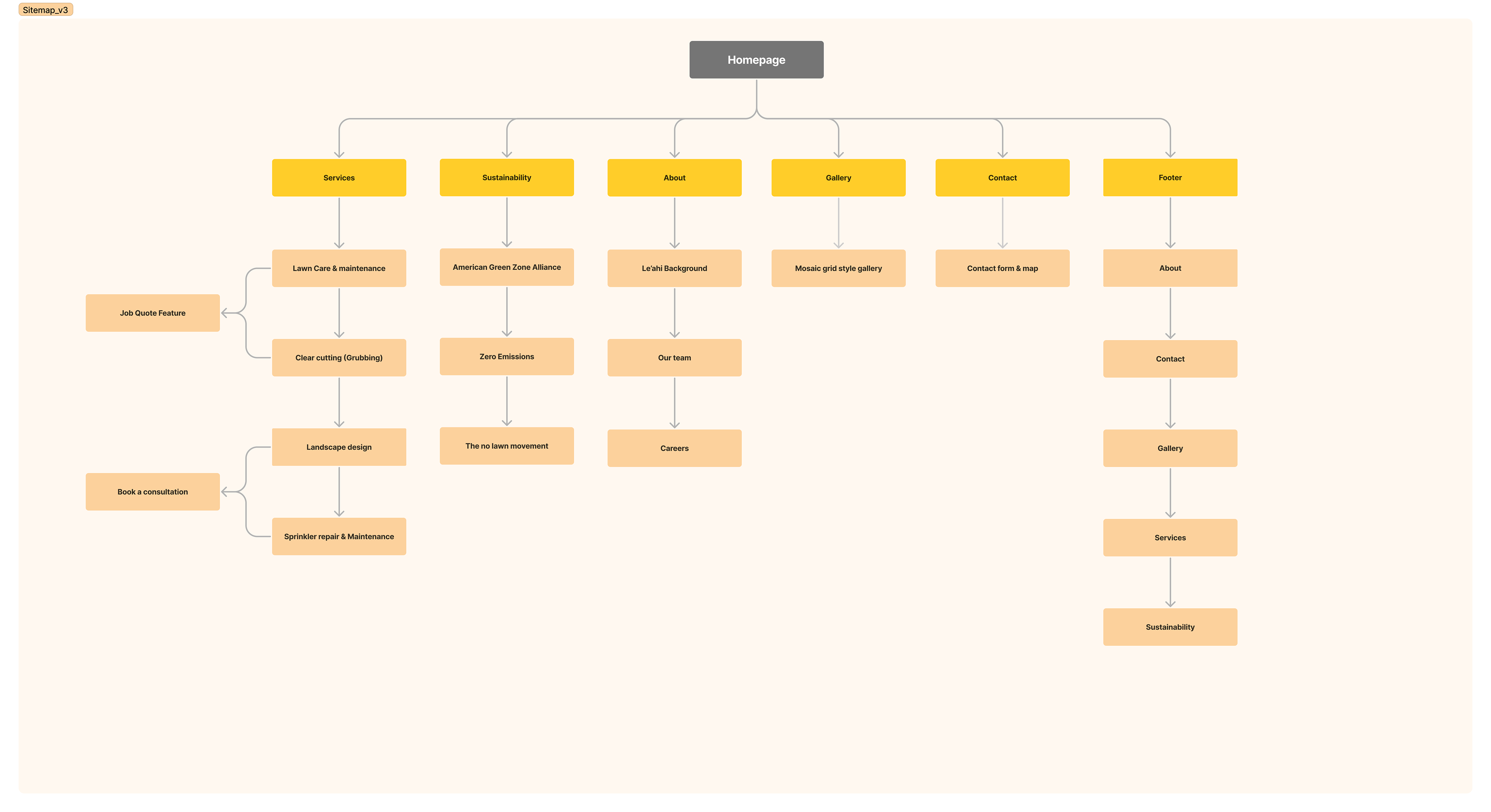
NEW SITEMAP
JOB ESTIMATE USER FLOW
This user flow underwent several iterations; originally requiring early personal info input, I removed this as it was likely unnecessary and could deter users from completing the flow.

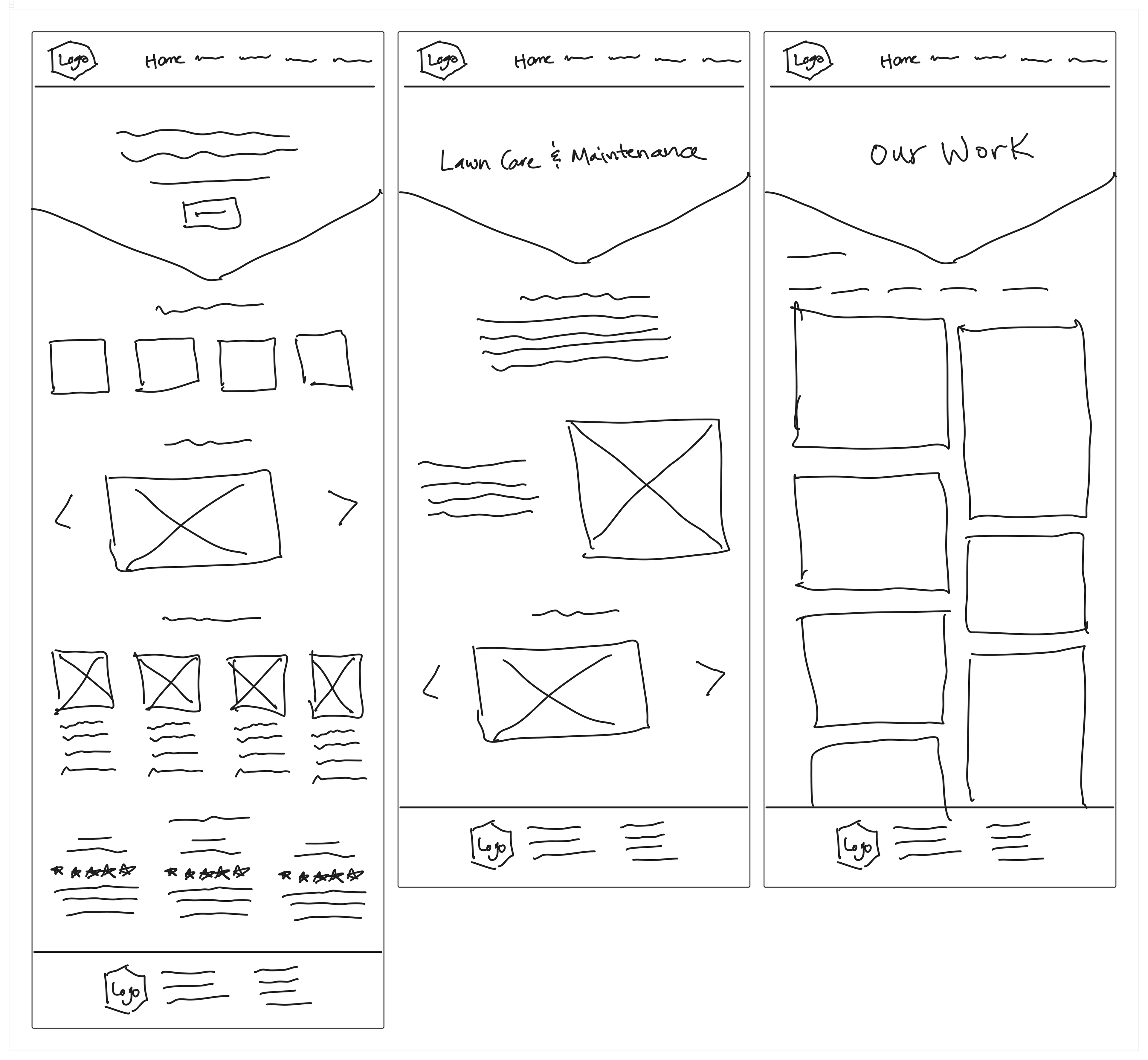
Low-Fidelity Wireframe Sketches
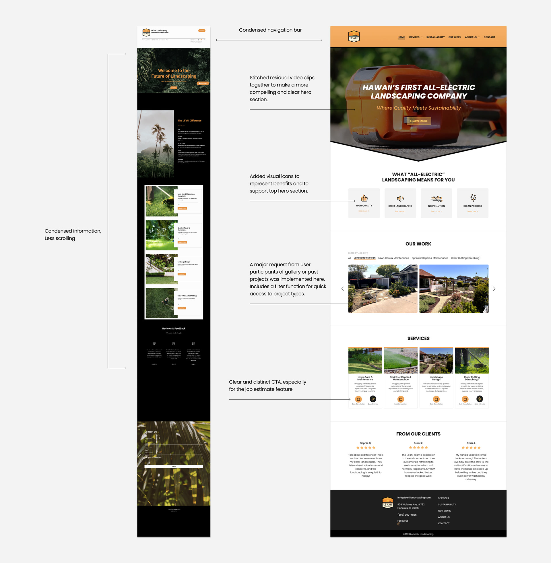
After synthesizing the user research findings, I began ideating solutions to address the key issues identified. I decided to start from a mobile-first approach since the original website is not responsive to other viewports beside desktop. My goal with these wireframes was to explore and iterate on possible design directions and layouts informed by common UI design patterns. I focused on addressing unclear messaging, including a gallery of past work, and including the job estimate feature. Below I walk through the key wireframes created and decisions made during this process, which led to our final high-fidelity mockups.
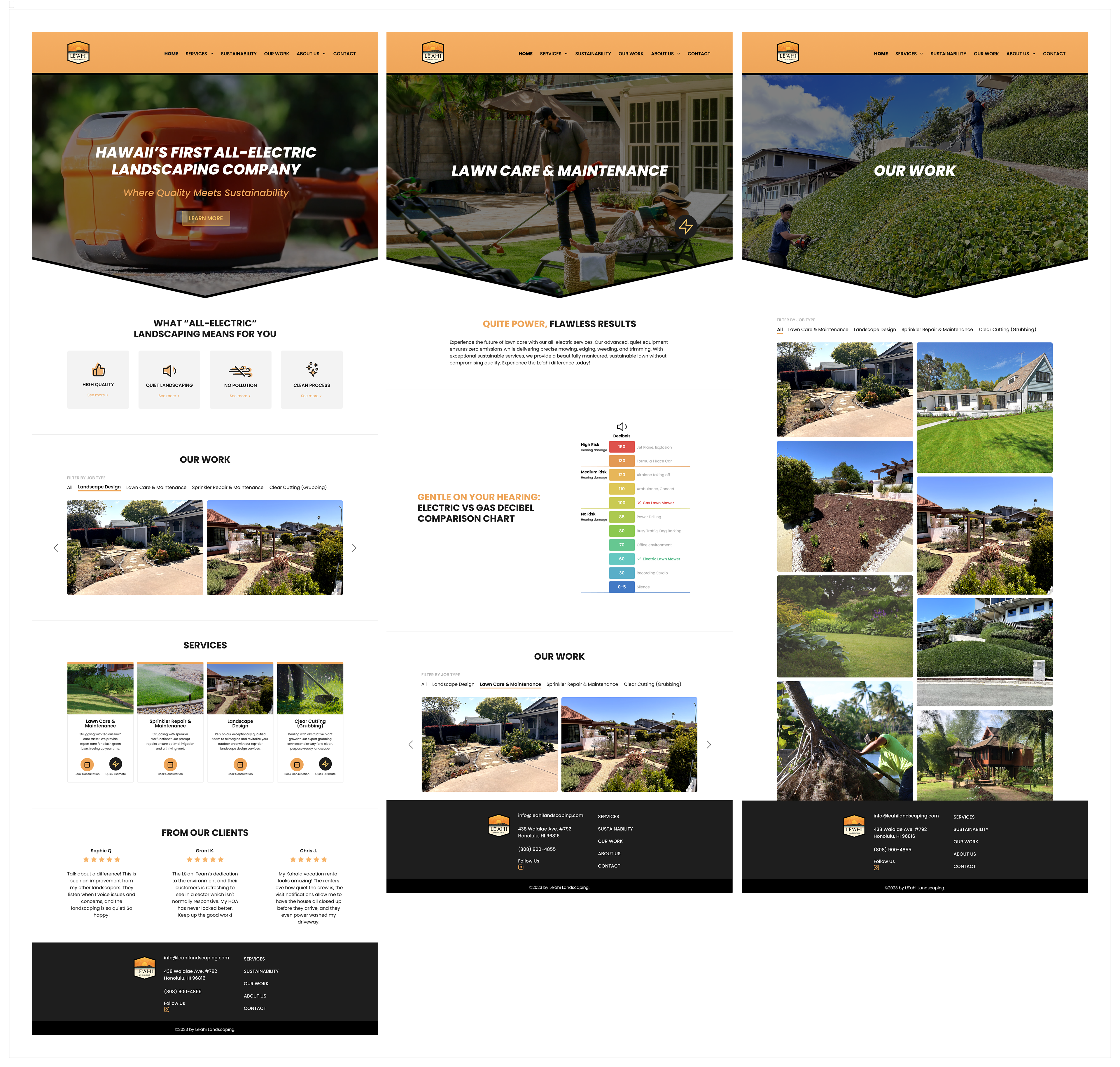
DESKTOP SCREENS

HOME PAGE
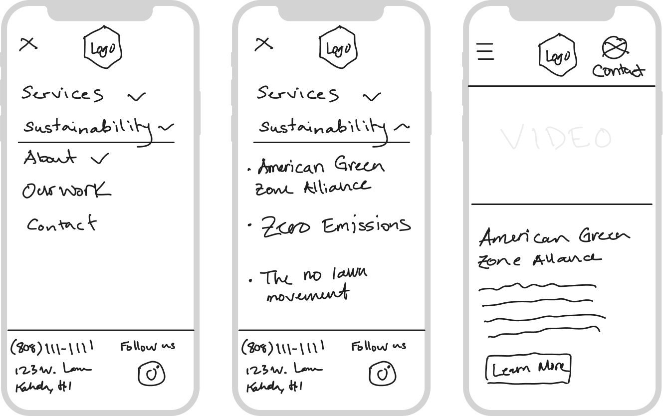
SUSTAINABILITY
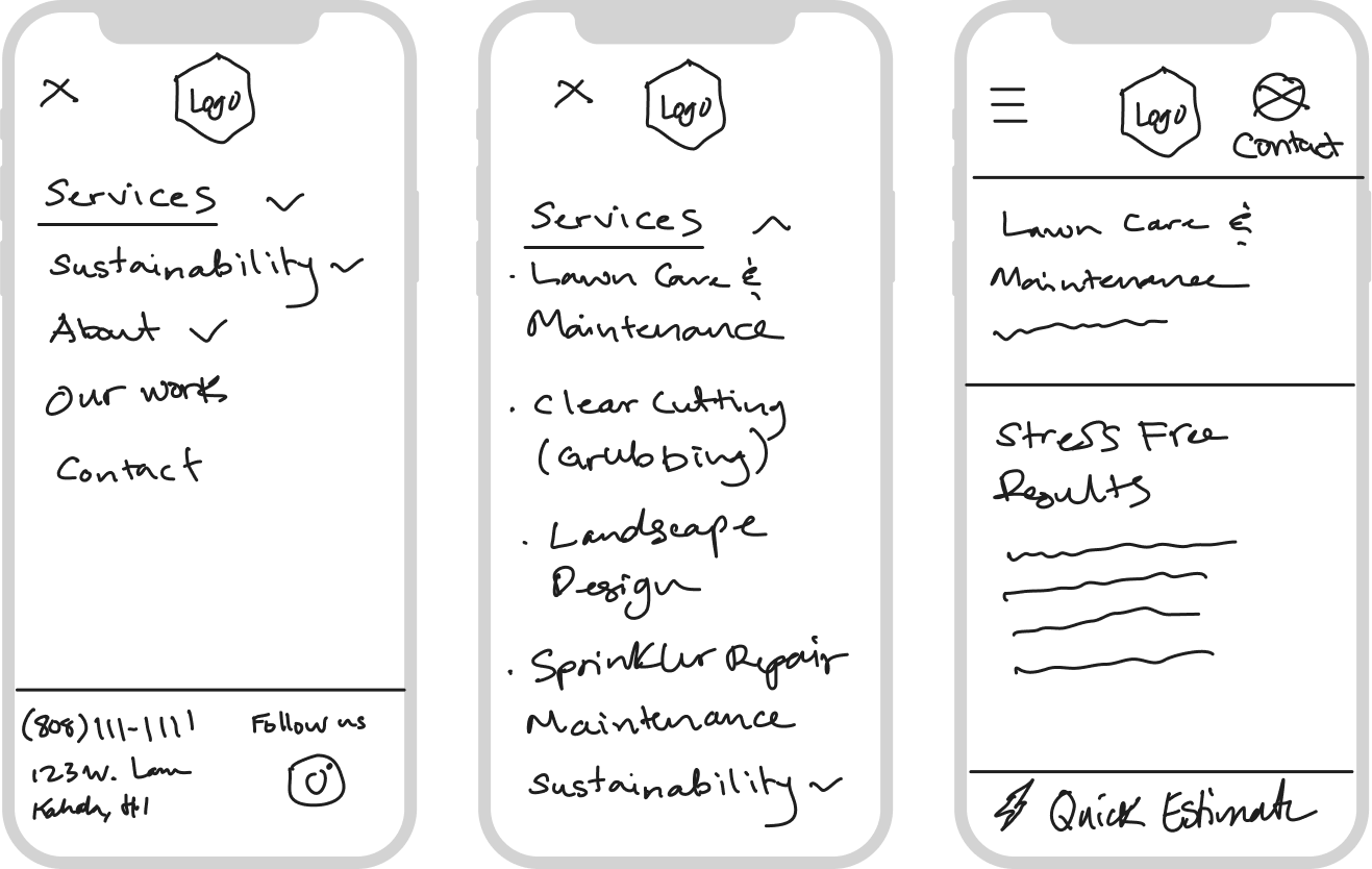
LAWN CARE & MAINTENANCE
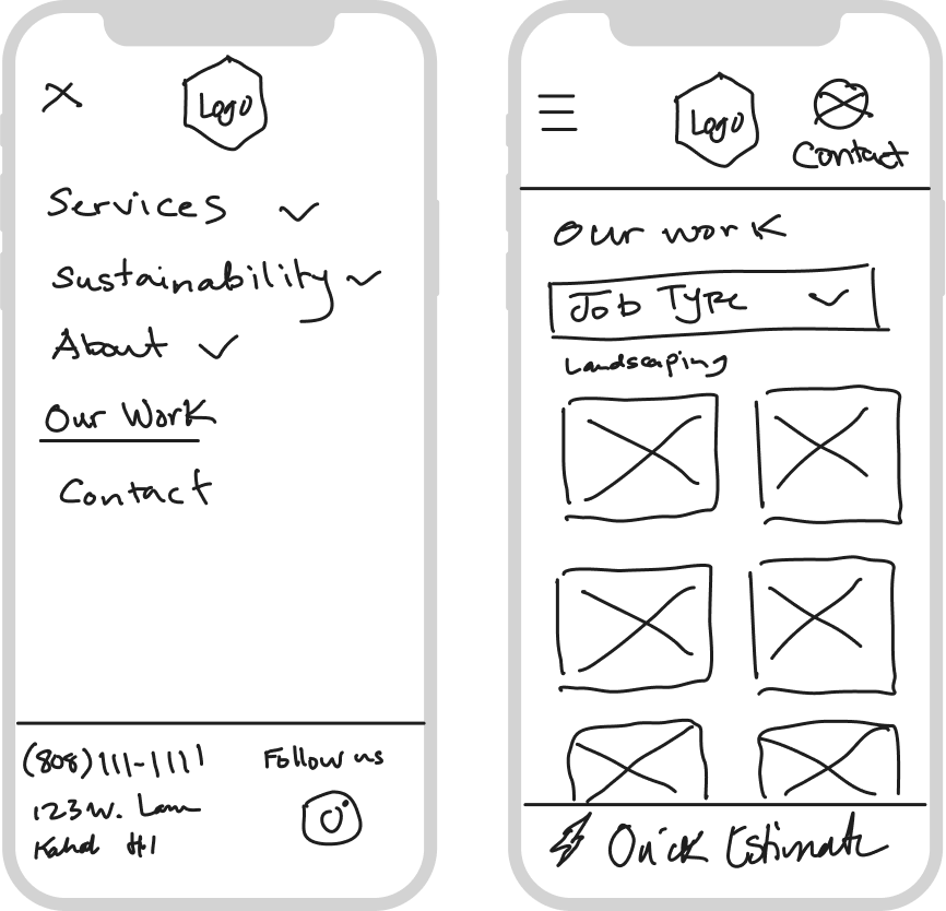
OUR WORK
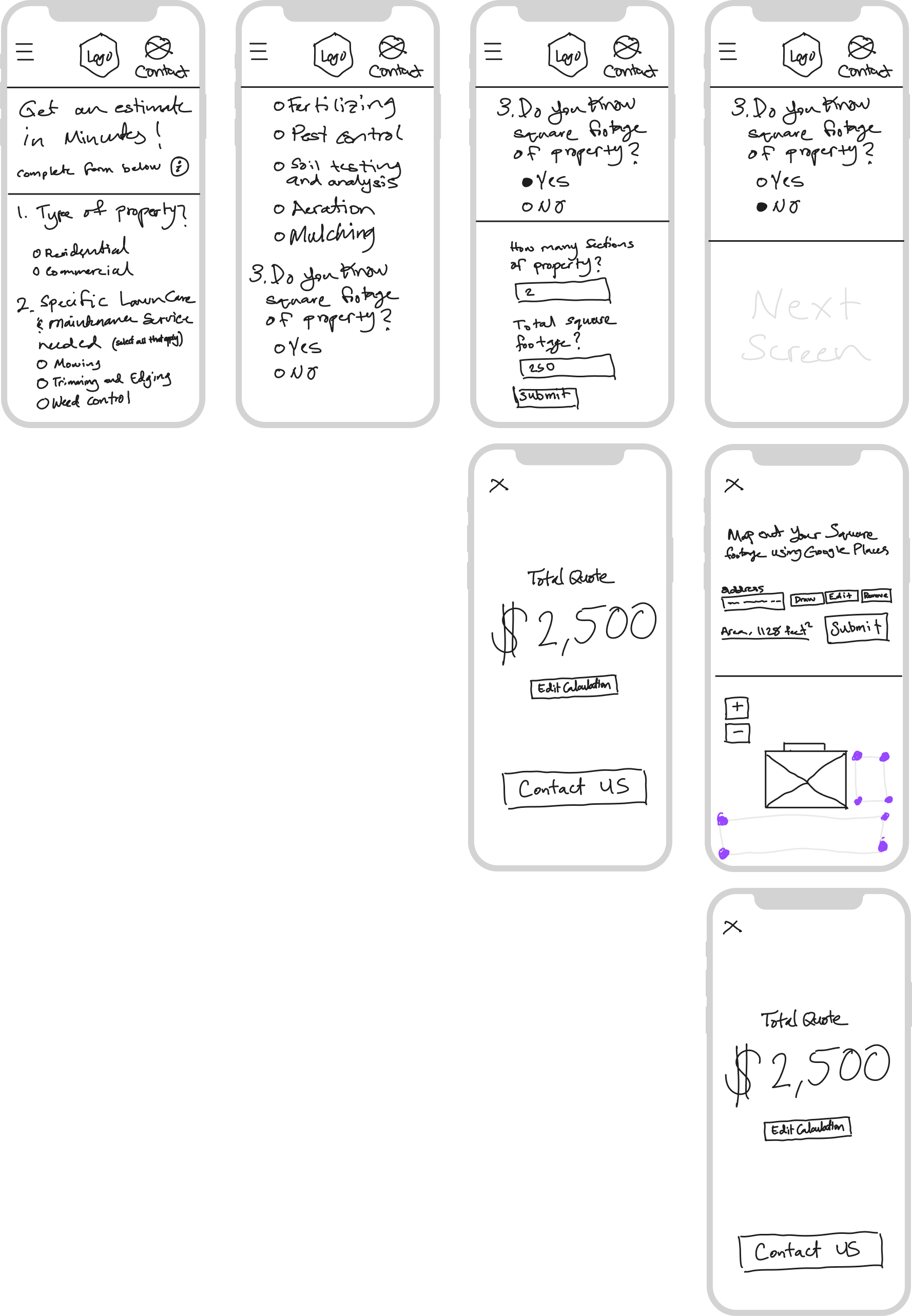
JOB ESTIMATE FEATURE
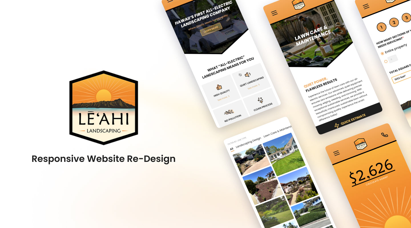
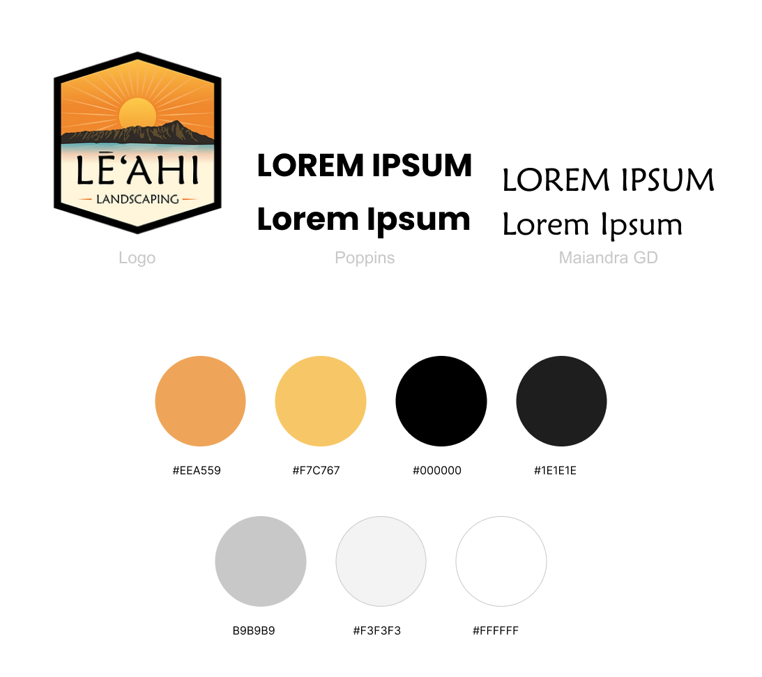
Branding
I refined the high-fidelity visual design by incorporating established brand elements including colors, typography, imagery, and video to create a cohesive experience aligned with the client's brand message and identity. Given the older target audience, I prioritized strong contrast and hierarchy throughout the design process.
MOBILE HIGH-FIDELITY SCREENS

MOBILE Interaction Showcase
SERVICES & JOB ESTIMATE FEATURE
SUSTAINABILITY & OUR WORK
DESKTOP HIGH-FIDELITY SCREENS
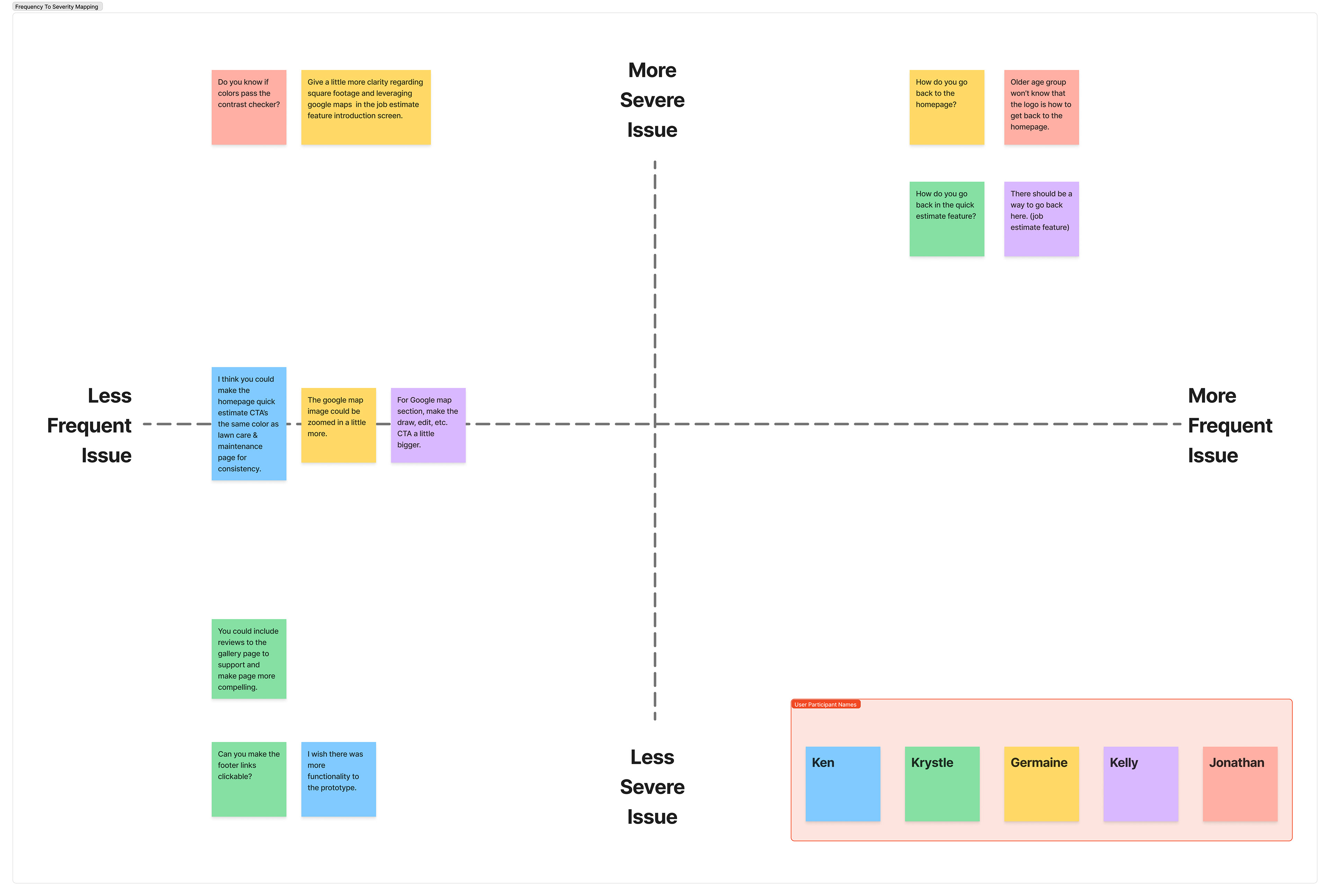
Usability Testing
4 participants, 1 week
Overall, feedback from usability test participants, who were also involved in the user interviews, indicated the redesigned sustainability messaging aligned well with the goals of being clear, concise, and impactful. Participants found the messaging more effective and compelling, particularly appreciating the visual aids that reinforced benefits. In summary, I believe the usability tests validated the redesigned user experience and sustainability approach was successful.
Success Rate
100% of participants were able to navigate each page and user flow without encountering any significant issues.
Task Completion Time
Users took about 1-2 minutes to complete the estimate feature flow. Navigating the entire mobile prototype took on average 2-4 minutes depending on how long they would spend on each page.
Error Rate
Overall, no significant errors hindered participants from completing the job estimate. Minor issues were users being unsure the logo returned to the homepage, and wanting to go back to change inputs. A back button was added to the estimate feature to address this.
Visual Design
Participants provided positive feedback on the visual design, finding the website on brand and visually pleasing.
BEFORE & AFTER COMPARISON
Next Steps
Continue to refine key screens including the job estimate feature and build out the remaining pages of website, including, "about", "Contact", "Book Consultation", and remaining service pages.